In the chaotic hustle and bustle of New York’s subways, where the symphony of screeching tracks and murmuring passengers forms a backdrop, inspiration often hides in plain sight. For Phil Imbriano, the senior designer at Topps, this monotonous daily commute became the birthplace for a revolutionary design. As his train rattled through the underground labyrinth, a distinct red-and-silver badge caught his eye—an emblem of sleek lines and curves that resonated with him beyond the mundane. A quick photo later, he found himself sketching new visions at his desk upon reaching Topps’ headquarters. Thus began the journey of creating the 2025 Topps Series 1 baseball cards.
Phil’s design odyssey was set in motion by this serendipitous moment, translating the essence of a momentary glimpse into the tactile world of collectible baseball cards. For design enthusiasts, there’s a recognition that inspiration often lurks in overlooked places, and Phil embodies this pursuit. “I love drawing inspiration from everyday things,” he admitted with the enthusiasm of an artist on a perennial quest for novelty. With his phone as a makeshift diary, he captures bits and bobs of interest—a habit that cost him not only digital storage but also sparked creativity that would culminate in something much more significant.
The fruit of this creative labor is a card design featuring two bold lines that dramatically lift up the card’s left side, then elegantly arc across the top. For aficionados of baseball card history, there might be a nostalgic connection; it’s reminiscent of the classic 1982 Topps set—an echo of the past albeit with a modern and personalized touch, as each line is color-matched to the team it represents. Noticing inadvertent winks to the past, Phil reflected, “The ’82 connection was a happy accident. But I think it works because it blends vintage style with a modern twist.”
Designing anything in a world committed to legacy and expectations is no small feat, and within the walls of Topps, this design had to pass a rigorous selection process against 20 other strong contenders. It’s a gladiatorial arena for graphic designers, steel sharpening steel in a quest to define each annual series. This competitive backdrop saw Phil’s design emerge victorious, integrating elements from several past concepts and cleverly updating the player’s position graphics with a modern field motif.
Building on his initial subway epiphany, Phil diligently crafted ten adaptations before the design stood ready—a testament to the painstaking process behind what many may perceive as a simple piece of cardboard. Reflecting on the labor of love these cards represent, Phil noted, “There’s so much that goes into this process. I don’t think most people realize how much work happens before they ever hold the card in their hands.”
Once a design passes the digital threshold, the next step brings it to the tangible world. Prototypes are no mere formality but a crucial phase, as emphasized by Clay Luraschi, the senior vice president of product at Topps. “When we’re down to the final five designs, we actually print them out and simulate opening a pack,” Luraschi revealed. This tactile assessment is more than just tradition; it’s a crucible where the design’s mettle is tested, embodying a legacy that stretches back over 74 years since Sy Berger famously conjured card designs from his humble kitchen table.
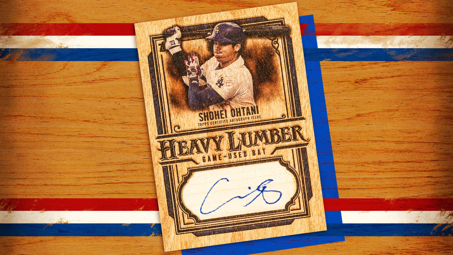
The 2025 edition doesn’t just rest on its laurels; it introduces a bevy of intriguing subsets reflecting the breadth of the baseball universe. Enthusiasts can look forward to expansions like Future Stars, All-Topps Team, and Training Grounds, each bringing its own charm. Additionally, unique cards such as City Connect Swatch Collection Autographs and the celebratory Freddie Dance for Dodgers fans add layers of collectible joy.
Responding to an era rich with digital music and celebrity culture, the nostalgic Signature Tunes series returns, blending the charisma of players with the artists behind their walk-up songs. Not to be outdone by the glamour of the moment, the First Pitch series fondly recalls celebrities who volunteered last season’s ceremonial tosses.
All of these innovations orbit around the gravitational pull of Phil’s striking base design. “I approach designing cards like I would a movie poster,” he explained, stressing that each card should make a statement—an art piece in miniature, a visual artifact for future retrospectives. For Clay and the team at Topps, the notion that a design could instantly evoke an era speaks volumes about its success. “Fifty years from now, people should be able to look at a card and instantly recognize the year it’s from. This one absolutely nails that idea,” Clay declared, cementing the 2025 Topps as a bridge linking the present with the past and the future.
Through the sheer power of inspiration and meticulous craftsmanship, a mere subway ride has transformed the way baseball cards are seen and remembered, contributing another layer to the tapestry of Topps’ enduring legacy.

